The following guidelines show how to include the Google Pay brand within your websites.
Google Pay payment buttons
The Google Pay payment button must always call the Google Pay API. The Google Pay API then calls the payment sheet where users can select their payment method.
Assets
The createButton()
JavaScript method dynamically inserts CSS rules and an SVG file from the Google CDN for an
HTML <button> element.
When you use the createButton()
method, you get:
- Brand Compliance: Seamlessly integrate a Google Pay payment button that automatically adheres to the latest Google Pay branding guidelines while offering customizable options to match your UI design with minimal effort.
- Customizable Shape: Fine-tune the button's corner roundness to seamlessly match your existing design aesthetic.
- Localized Experience: The button's caption automatically translates to the user's browser language, enhancing accessibility.
- Personalized for Users: Help users discover available payment methods in their Google Pay wallet for a faster checkout process.
If this convenience method or the supported languages don't suit your needs, contact us.
Style
All Google Pay payment buttons exist in two styles: dark and light. You can see examples of both styles in the Assets section. The Google Pay brand name must not be translated. Don't create buttons with your own localized text.
| Button Type | Dark | Light |
| BOOK |  |
 |
| BUY |  |
 |
| CHECKOUT |  |
 |
| DONATE |  |
 |
| ORDER |  |
 |
| PAY |  |
 |
| PLAIN |  |
 |
| SUBSCRIBE |  |
 |
Use the button type verbiage that best suits your checkout page. |
Use dark buttons on light backgrounds to provide contrast. |
Use light buttons on dark or colorful backgrounds. |
Personalization
When users have an eligible card on their Google Pay account, the "Buy", "Pay" and "Plain" payment buttons will display the card network and the last four digits of the card number. The card network will be displayed in the same position as the "Buy with" or "Pay with" text.
| Button Type | Dark | Light |
| BUY, PAY and PLAIN |  |
 |
Use the BUY, PAY or PLAIN button type to enable personalization. |
Use dark buttons on light backgrounds to provide contrast. |
Use light buttons on dark or colorful backgrounds. |
Custom button
Use the following tool to preview the appearance of each button:
Clear space
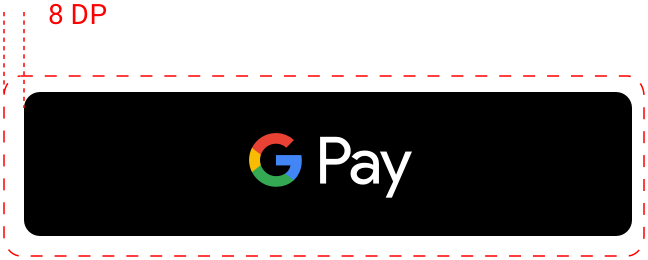
Always maintain the minimum clear space of 8 dp on all sides of the payment button. Ensure the clear space is never broken with graphics or text.

Examples

| If you place a Google Pay button next to another button, make sure the Google Pay button is equal in size to the other button. | Always use a Google Pay button that contrasts with the background on which it appears. |

| When you adjust the size of the Google Pay button, always keep its proportions consistent. |
Dos and Don'ts
| Do | Don't |
|---|---|
|
|
Google Pay mark
Use only the Google Pay mark that's provided in these guidelines when you show Google Pay as an option in your payment flows.
Assets
Click the following button to download the Google Pay mark in an SVG file format:
Download assetsMark
Use the following Google Pay mark when you show Google Pay as a payment option:

Display "Google Pay" in text next to the mark if you do so for other brands. Don't change the color or weight of the mark's outline, or alter the mark in any way. Use only the mark provided by Google.
Clear space
Always maintain at least half (0.5x) of the height of the capital G on all sides of the Google Pay acceptance mark. Make sure the clear space is even with any other brand identities that you display.

Size
Adjust the height to match the other brand identities displayed in your payment flow. Don't make the Google Pay mark smaller than other brand identities.

Dos and Don'ts
| Do | Don't |
|---|---|
|
|
Google Pay in text
You may use text to indicate Google Pay as a payment option, and to promote Google Pay in your marketing communication.
- Capitalize the letters "G" and "P"
- Always use an uppercase "G" and an uppercase "P" followed by lowercase letters. Don't capitalize the full name "GOOGLE PAY" unless it's to match the typographic style on your website. Never use an uppercase "GOOGLE PAY" in your marketing communication.
- Don't abbreviate Google Pay
- Always write out the words "Google" and "Pay."
- Match the style on your website
- Set "Google Pay" in the same font and typographic style as the rest of the text on your website. Don't mimic Google's typographic style.
- Don't translate Google Pay
- Always write "Google Pay" in English. Don't translate it into another language.
- Use the trademark symbol the first time "Google Pay" appears in marketing communication
- When you use "Google Pay" in your marketing communication, show the trademark symbol, ™, the first or most prominent time that it appears. Don't use the trademark symbol when you list Google Pay as a payment option on your website.

| If you don't display brand identities for other payment options, then represent "Google Pay" with text. | Set “Google Pay” in the same font and typographic style as the rest of the text on your site. |
Google Pay best practices
Maximize your conversions with checkout flows and payment sheets that let customers quickly and easily review their payment information and confirm their purchase.
The following are best practices:
- Make Google Pay the primary payment option.
- Wherever possible, display the Google Pay button prominently. You can also make it the default option, or the only payment option.
- Let your customers make purchases without an account
- Account creation slows down the checkout process and can lead to abandoned carts. Use Google Pay to enable faster guest checkout. If you'd like your customers to create an account, allow them to do so after they complete their purchase.
- Use Google Pay to initiate payment during cart checkout
- The Google Pay button brings up the payment sheet. On the payment sheet, customers can only select and confirm a single payment method and shipping address. Be sure to get all the other information that you need before you give customers the option to select the Google Pay button. Other information can include the following:
- An item's size, color, or quantity.
- The option to add a gift message or apply a promo code.
- The ability to choose different shipping speeds and destinations for individual items.
- If a customer doesn't provide the necessary information, offer real-time feedback to let them know what you need before they can bring up the payment sheet.
- Add the Google Pay button to the product detail pages in addition to the cart checkout
- You can speed up single-item checkout if you let customers make individual purchases right from your product detail pages. If a customer chooses this option, be sure to exclude any other items they have in their shopping cart because the payment sheet only lets them confirm their payment and shipping information.
- Include Google Pay on confirmation pages and receipts
- When you display payment information on confirmation pages and email receipts, make sure you indicate that the customer has paid with Google Pay, and that you display Google Pay in the same manner as other payment methods.
- Never display full account numbers, expiration dates, or other payment method details to the user. Always use the descriptive text returned by the Google Pay API to identify the payment method.
- The following are examples of acceptable descriptive text:
- "Network •••• 1234 with Google Pay"
- "Network •••• 1234 (Google Pay)"
- "Google Pay (Network •••• 1234)"
- "Paypal abc...d@gmail.com with Google Pay"
- "Payment method: Google Pay"
- "Paid with Google Pay"

Put it all together
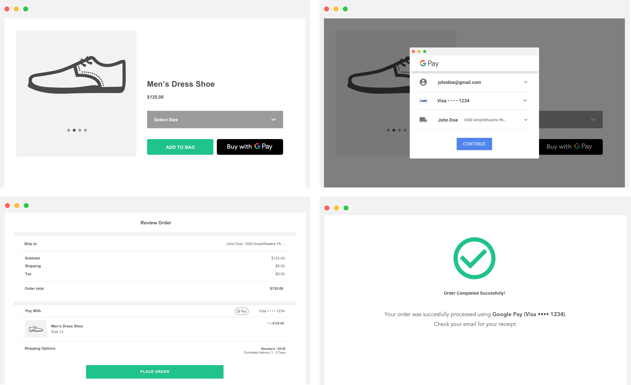
The following image illustrates a completed integration. The integration also includes the Item selection/Pre-purchase step, Transaction step, Google Pay selector step, and Post-purchase step.

Get approval
Once you've integrated the Google Pay API, in order to gain production access, you need to get approval for all the places where you display or reference Google Pay.
Complete our Integration checklist to submit your web integration for review. You should receive approval or feedback within one business day.