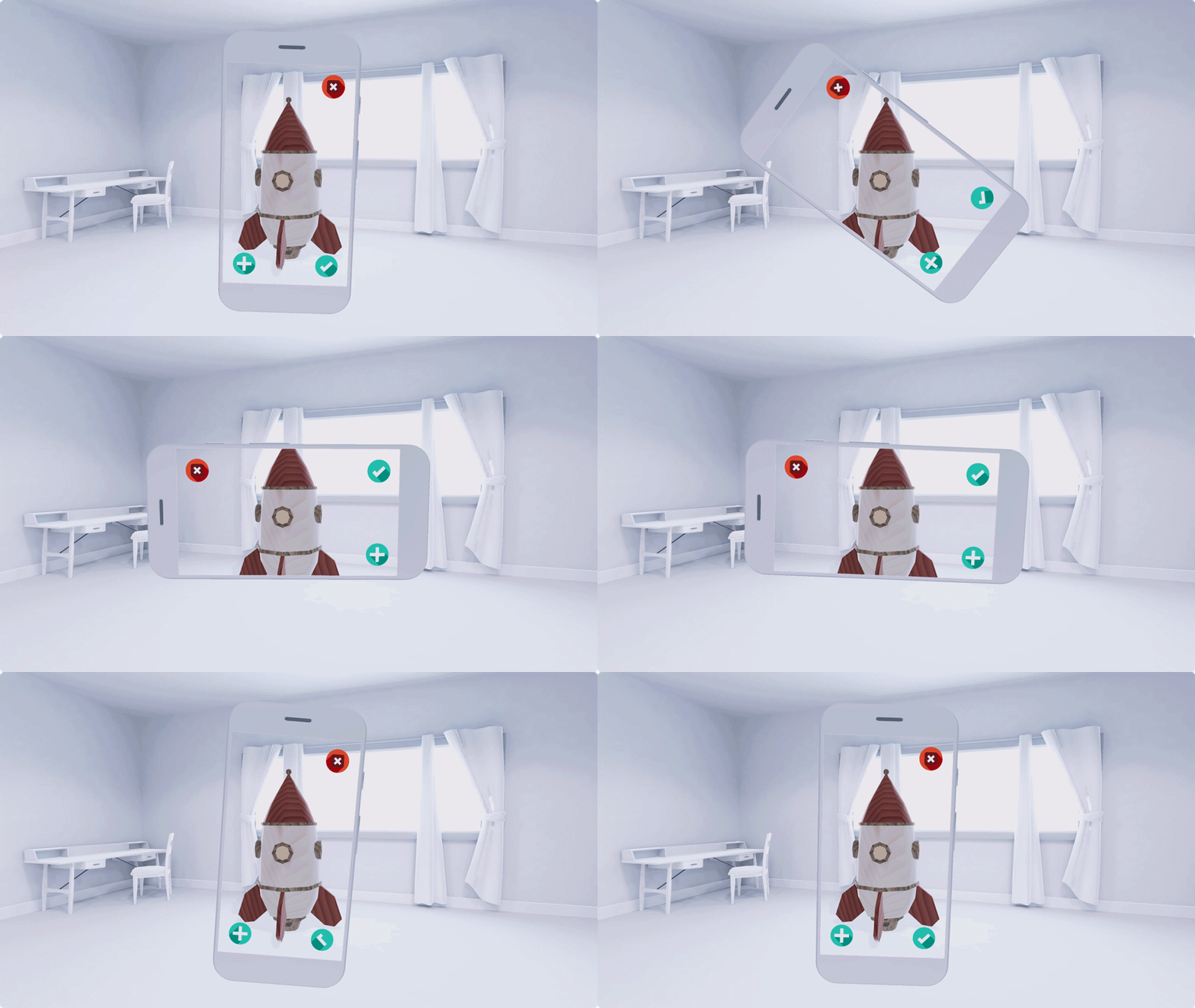
Design UI components for immersive experiences that aim to visually blend real and virtual spaces.
Create a visually clean UI that lends itself seamlessly to the immersive experience you’re building.
Interface
Create a world that’s immersive and easy to use
Immerse users, don’t distract them.
Try to interrupt your AR world as little as you can. Get users into the experience, and then get out of the way.
Avoid pop-ups and full-screen takeovers unless the user explicitly selects it. Buttons, 2D alerts, and notifications can distract the user from the 3D world that you’re creating around them. Instead, let users focus on the scene itself.
Persistent 2D overlays can also disrupt the user’s immersion. It’s a constant reminder that the world they’re looking at isn’t completely real.

Sudden pop-ups and quick transitions can break the immersive AR experience.
Make the controls so easy, users won’t have to think about what they mean
It’s best to keep the user focused on the AR experience itself. Sometimes, however, an app needs to have onscreen controls.
In those cases, make the controls as simple as possible. Ideally, a user should be able to trigger an action without looking at it. Think of the camera button on your phone. It’s big, it’s not labeled, and you can tap it almost without thinking about it.
Maintain the continuity of the experience. Try to avoid taking the user out of a scene too often. For instance, if users need to select, customize, or share an AR object, try to figure out a way they can do it without leaving AR.
Onboarding and instructions
Provide an onboarding flow within the experience
Let users launch AR quickly. Make your tutorial a part of the main experience flow. Avoid teaching users all the key tasks or mechanics at once.
Rather, show them how to perform these tasks as they show up in the game. Users won’t be overloaded with information, and they’ll be able to link helpful instructions and tips to the task at hand.
Guide the user visually
Use a combination of visual cues, motion, and animation to teach users. Illustrate and use in-app experiences as much as possible. Text instructions can take users out of the experience and make it harder to remember what they’re supposed to do.
For example, if you want users to swipe, give them an arrow or a hand icon rather than showing the word “swipe.”
Use familiar UI patterns
Take advantage of your users’ knowledge. If there’s a standard UX interaction model for a certain action, such as tapping or dragging, use it! You won’t have to teach the user a whole new way to perform simple tasks, and you can dive right into the important part of your experience.
Landscape & portrait
Provide support for both portrait and landscape modes. If this isn’t possible, select the one that’s best for your experience.
Supporting both modes creates a more immersive experience and increases user comfort.
Think about camera and button placement for each mode. Pay attention to how camera positioning affects depth sensing, spatial awareness, and accurate surface measurements in each mode.

Rotate the UI and avoid cutting the camera feed.
Errors
Help users easily recover from missteps and errors.
Whether the error came from the system or the user, make it easy to get back into the experience. Use a combination of visual cues, animation, and text to show a clear path to resolution.
You can communicate what went wrong, especially if it helps avoid that error in the future. Avoid blaming the user. Focus on getting the user to take the right action.
Sample error states can include:
- No camera images: On Android 12 (API level 31) or later, make sure that "Block Camera" is set to OFF in system settings.
- Dark environment: Too dark to scan. Try turning on the lights or moving to a well-lit area.
- User moving device too fast: Device moving too fast. Try moving more slowly.
- User blocking the camera sensor: Looks like the sensor is blocked. Try moving your finger or adjusting the device’s position.
Permissions
Clearly tell users why the app needs certain permissions.
Ask for permissions only when it’s necessary for users to move forward with the experience.
Be clear about the relevance and benefits of each permission. For instance, if the app needs access to the camera for AR to work, or the user’s position for multiplayer experiences, let them know.
