Using the Navigation SDK for Android, you can modify the user experience with your map by determining which of the built-in UI controls and elements appear on the map. You can also adjust the visual appearance of the navigation UI. Refer to the Policies page for guidelines on acceptable modifications to the navigation UI.
This document describes how to modify your map's user interface in two ways:
Map UI controls
Map UI controls are the recommended way to place custom UI elements on the navigation view to ensure proper positioning. When the built-in layout changes,
Navigation SDK for Android automatically repositions your custom controls. You may set one custom control view at a time
for each position. If your design requires multiple UI elements, you can place
them in a ViewGroup and pass it to the setCustomControl method.
The setCustomControl
method
provides positions as defined in the CustomControlPosition
enum:
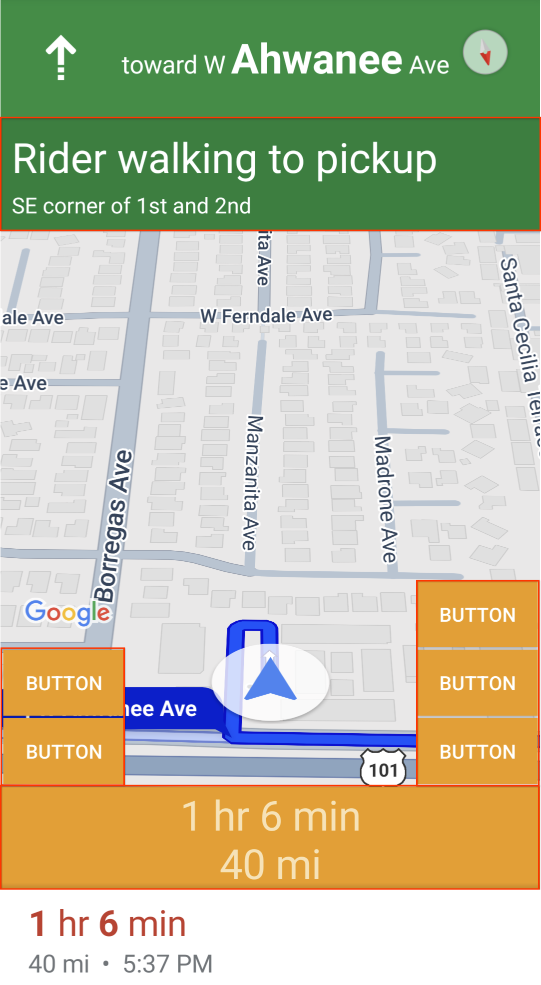
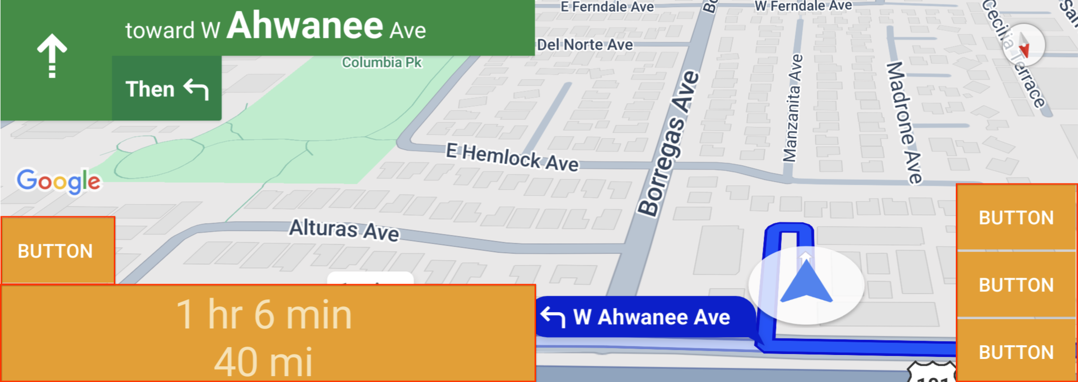
SECONDARY_HEADER(appears in portrait mode only)BOTTOM_START_BELOWBOTTOM_END_BELOWFOOTER
Add a custom control
- Create an Android View with the custom UI element or ViewGroup.
- Inflate the XML or instantiate the custom view to get an instance of the view.
Use
NavigationView.setCustomControlorSupportNavigationFragment.setCustomControlwith the chosen custom control position from theCustomControlPositionenum.The example below creates a fragment and adds a custom control in the secondary header position.
 mNavFragment.setCustomControl(getLayoutInflater().
   inflate(R.layout.your_custom_control, null),
   CustomControlPosition.SECONDARY_HEADER);
 ```
Remove a custom control
To remove a custom control, call the
setCustomControl method with a null view parameter and the chosen custom control position.
For example, the following snippet removes the any custom secondary header and returns to the default content:
mNavFragment.setCustomControl(null, CustomControlPosition.SECONDARY_HEADER);
Custom control positions
Secondary header
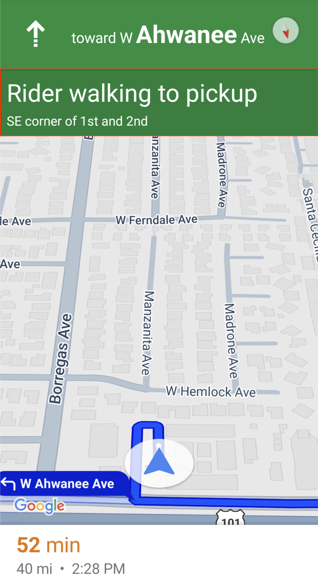
To use this custom control position, pass the position CustomControlPosition.SECONDARY_HEADER to setCustomControl.
By default, screen layouts in navigation mode provide a position for a secondary header located beneath the primary header. This secondary header appears when necessary, such as with lane guidance. Your app can use this secondary header position of the layout for custom content. When you use this feature, your control covers any default secondary header content. If your navigation view has a background, that background remains in place, covered by the secondary header. When your app removes the custom control, any default secondary header can appear in its place.
The custom secondary header position aligns its top edge with the bottom edge of
the primary header. This position is only supported in portrait mode. In
landscape mode, the secondary header is unavailable, and the layout does not
change.
Bottom start
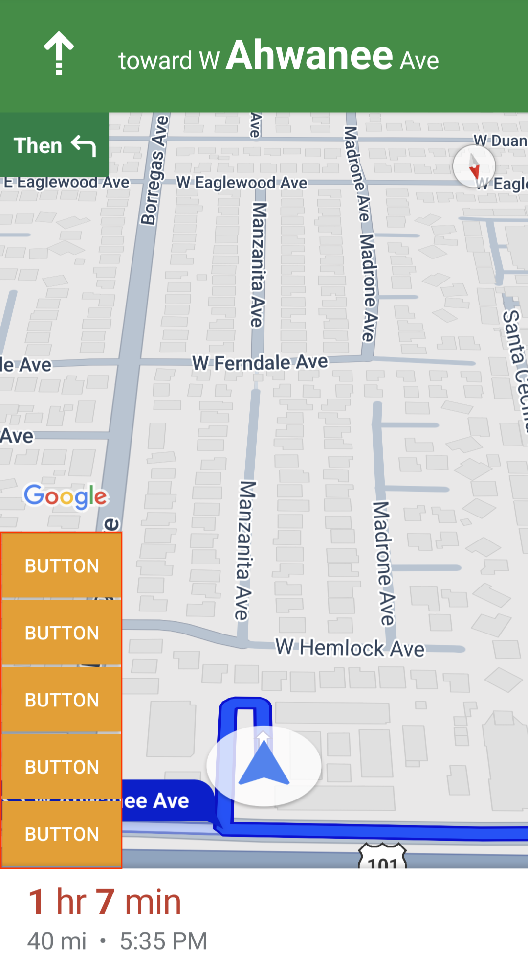
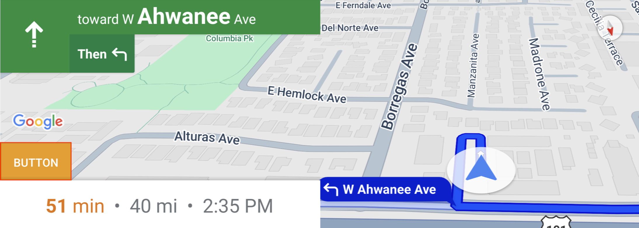
To use this custom control position, pass the position CustomControlPosition.BOTTOM_START_BELOW to setCustomControl.
This custom control position sits in the bottom start corner of the map. In both portrait mode and landscape mode, it sits above the ETA card and/or custom footer (or along the bottom of the map if neither are present), and Nav SDK elements including the re-center button and Google logo move up to account for the height of the custom control view. This control is positioned inside the visible map bounds, so any padding added to the bottom or start edges of the map will also change the position of this control.
Bottom end
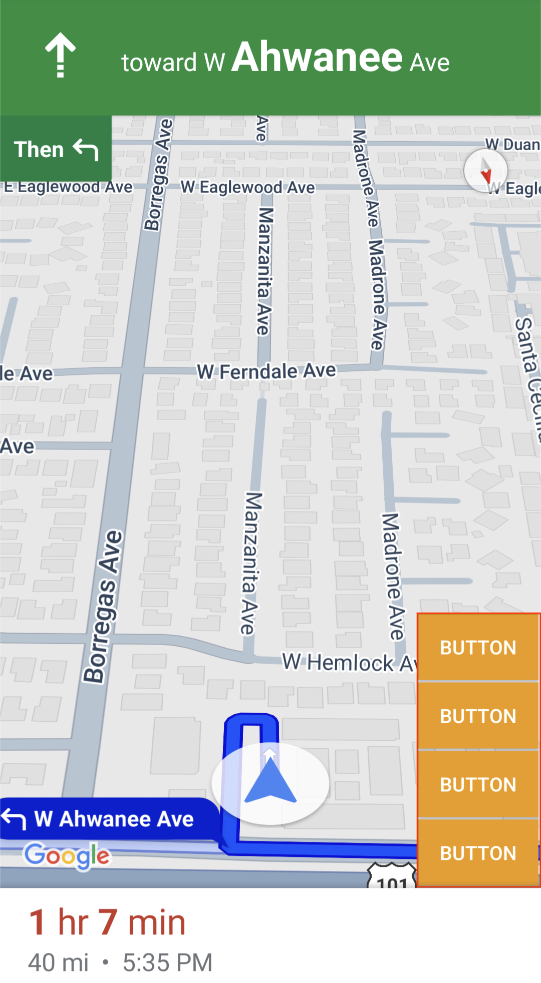
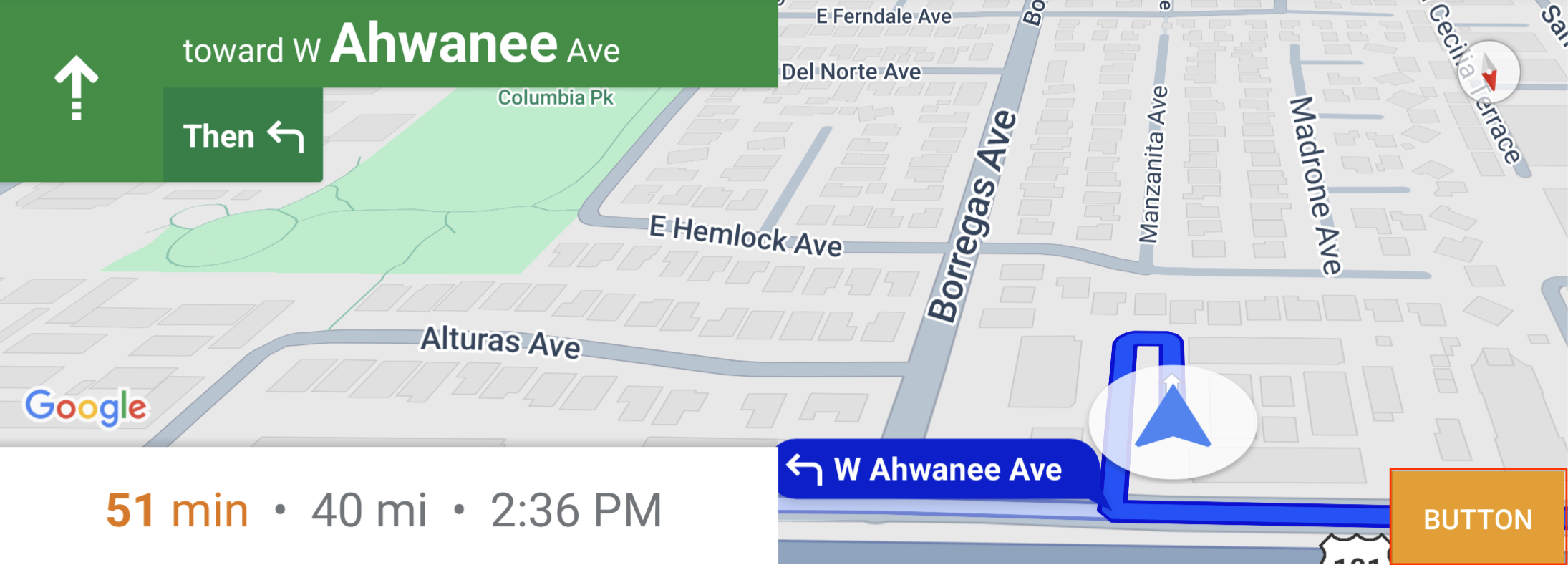
To use this custom control position, pass the position CustomControlPosition.BOTTOM_END_BELOW to setCustomControl.
This custom control position sits in the bottom end corner of the map. In portrait mode, it sits above the ETA card and/or custom footer (or along the bottom of the map if neither are present), but in landscape mode it is aligned with the bottom of the map. Any Nav SDK elements visible along the end side (right side in LTR) move up to account for the height of the custom control view. This control is positioned inside the visible map bounds, so any padding added to the bottom or end edges of the map will also change the position of this control.
Footer
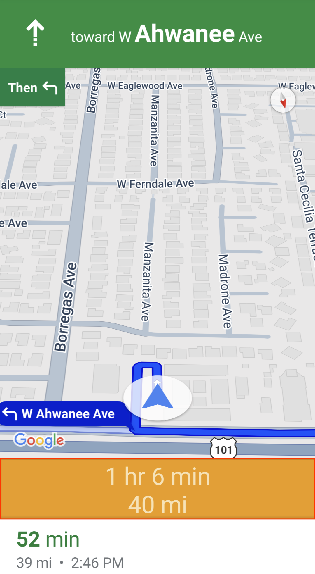
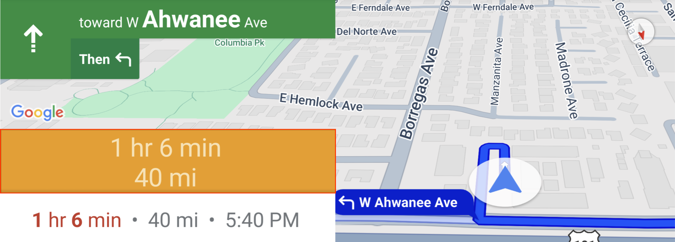
To use this custom control position, pass the position CustomControlPosition.FOOTER to setCustomControl.
This custom control position is designed for a custom footer view. If the Nav SDK ETA card is visible, this control sits above it. If not, the control is aligned with the bottom of the map. Unlike the BOTTOM_START_BELOW and BOTTOM_END_BELOW custom controls, this control is positioned outside the visible map bounds, which means that any padding added to the map won't change the position of this control.
In portrait mode, the custom footer is full width. Custom controls in both CustomControlPosition.BOTTOM_START_BELOW and CustomControlPosition.BOTTOM_END_BELOW positions, as well as Nav SDK UI elements like the re-center button and the Google logo, are positioned above the custom control footer. The default position of the chevron takes the custom footer height into account.
In landscape mode, the custom footer is half width and aligned to the start side (left side in LTR), just like the Nav SDK ETA card. The custom controls in the CustomControlPosition.BOTTOM_START_BELOW position and Nav SDK UI elements like the re-center button and the Google logo are positioned above the custom control footer. The custom controls in CustomControlPosition.BOTTOM_END_BELOW position and any Nav SDK UI elements along the end side (right side in LTR) stay aligned with the bottom of the map. The default position of the chevron does not change when a custom footer is present since the footer does not extend to the end side of the map.
Custom controls in CustomControlPosition.BOTTOM_START_BELOW and CustomControlPosition.BOTTOM_END_BELOW positions, as well as Nav SDK UI elements like the re-center button and the Google logo are positioned above the custom control footer.
Map UI accessories
The Navigation SDK for Android provides UI accessories that appear during navigation similar to those found in the Google Maps for Android application. You can adjust the visibility or visual appearance of these controls as described in this section. Changes you make here reflect during the next navigation session.
Refer to the Policies page for guidelines on acceptable modifications to the navigation UI.
View the code
Modify the navigation header
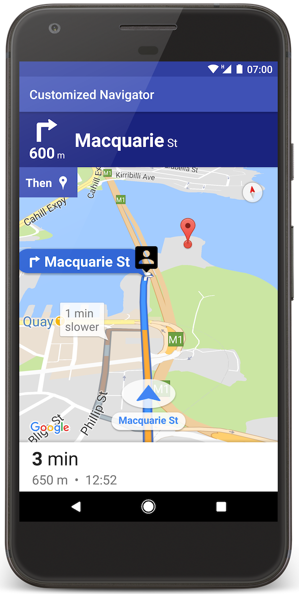
Use
SupportNavigationFragment.setStylingOptions()
or
NavigationView.setStylingOptions()
to change the theme of the navigation header and the next-turn indicator that
appears below the header when available.
You can set the following attributes:
| Attribute Type | Attributes |
|---|---|
| Background color |
|
| Text elements for instructions |
|
| Text elements for next steps |
|
| Maneuver icons |
|
| Lane guidance |
|
The following example shows how to set styling options:
private SupportNavigationFragment mNavFragment;
mNavFragment = (SupportNavigationFragment) getFragmentManager()
  .findFragmentById(R.id.navigation_fragment);

// Set the styling options on the fragment.
mNavFragment.setStylingOptions(new StylingOptions()
  .primaryDayModeThemeColor(0xff1A237E)
  .secondaryDayModeThemeColor(0xff3F51B5)
  .primaryNightModeThemeColor(0xff212121)
  .secondaryNightModeThemeColor(0xff424242)
  .headerLargeManeuverIconColor(0xffffff00)
  .headerSmallManeuverIconColor(0xffffa500)
  .headerNextStepTypefacePath("/system/fonts/NotoSerif-BoldItalic.ttf")
  .headerNextStepTextColor(0xff00ff00)
  .headerNextStepTextSize(20f)
  .headerDistanceTypefacePath("/system/fonts/NotoSerif-Italic.ttf")
  .headerDistanceValueTextColor(0xff00ff00)
  .headerDistanceUnitsTextColor(0xff0000ff)
  .headerDistanceValueTextSize(20f)
  .headerDistanceUnitsTextSize(18f)
  .headerInstructionsTypefacePath("/system/fonts/NotoSerif-BoldItalic.ttf")
  .headerInstructionsTextColor(0xffffff00)
  .headerInstructionsFirstRowTextSize(24f)
  .headerInstructionsSecondRowTextSize(20f)
  .headerGuidanceRecommendedLaneColor(0xffffa500));
Turn off the traffic layer
Use
GoogleMap.setTrafficEnabled()
to enable or disable the traffic layer on the map. This setting affects the
indications of traffic density shown on the map as a whole. However, it does not
affect the traffic indications on the route plotted by the navigator.
private GoogleMap mMap;
// Get the map, and when the async call returns, setTrafficEnabled
// (callback will be on the UI thread)
mMap = mNavFragment.getMapAsync(navMap -> navMap.setTrafficEnabled(false));
Enable traffic lights and stop signs
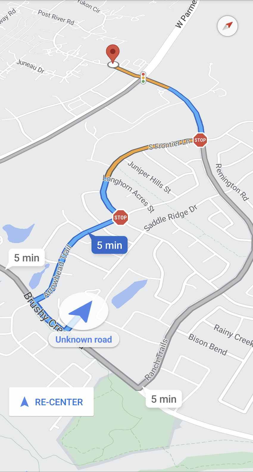
You can enable the display of traffic lights and stop signs in the map during active navigation, which provides additional context for routes and trip maneuvers.
By default, traffic lights and stop signs are disabled in the
Navigation SDK. To enable this feature, call
DisplayOptions
for each feature independently.
DisplayOptions displayOptions =
  new DisplayOptions().showTrafficLights(true).showStopSigns(true);
Add custom markers
Navigation SDK for Android now uses Google Maps APIs for markers. Go to the Maps API documentation for more information.
Floating text
You can add floating text anywhere in your app, provided it does not cover the Google attribution. The Navigation SDK doesn't support anchoring the text to a latitude/longitude on the map, or to a label. Go to Info windows for more information.
Display the speed limit
You can programmatically show or hide the speed limit icon. Use
NavigationView.setSpeedLimitIconEnabled()
or
SupportNavigationFragment.setSpeedLimitIconEnabled()
to display or hide the speed limit icon. When enabled, the speed limit icon
displays in a bottom corner during guidance. The icon displays the speed limit
of the road that the vehicle is traveling on. The icon only appears in locations
where reliable speed limit data is available.
 // Display the Speed Limit icon
 mNavFragment.setSpeedLimitIconEnabled(true);
The speed limit icon is temporarily hidden when the recenter button is displayed.
Set night mode
You can programmatically control the behavior of night mode. Use
NavigationView.setForceNightMode()
or
SupportNavigationFragment.setForceNightMode()
to turn night mode on or off, or let the Navigation SDK for Android
control it.
AUTOLets the Navigation SDK determine the appropriate mode according to the device location and local time.FORCE_NIGHTforces night mode on.FORCE_DAYforces day mode on.
The following example shows forcing night mode to turn on within a navigation fragment:
// Force night mode on.
mNavFragment.setForceNightMode(FORCE_NIGHT);
Display directions list
First, create the view and add it to your hierarchy.
void setupDirectionsListView() {
  // Create the view.
  DirectionsListView directionsListView = new DirectionsListView(getApplicationContext());
  // Add the view to your view hierarchy.
  ViewGroup group = findViewById(R.id.directions_view);
  group.addView(directionsListView);

  // Add a button to your layout to close the directions list view.
  ImageButton button = findViewById(R.id.close_directions_button); // this button is part of the container we hide in the next line.
  button.setOnClickListener(
      v -> findViewById(R.id.directions_view_container).setVisibility(View.GONE));
}
Be sure to forward life cycle events to the DirectionsListView just like they
are with NavigationView. For example:
protected void onResume() {
  super.onResume();
  directionsListView.onResume();
}
Hiding alternate routes
When the user interface becomes cluttered with too much information, you can
reduce clutter by displaying fewer alternate routes than the default (two), or
by displaying no alternate routes at all. You can configure this option before
you fetch the routes by calling the RoutingOptions.alternateRoutesStrategy()
method with one of the following enumeration values:
| Enumeration Value | Description |
|---|---|
| AlternateRoutesStrategy.SHOW_ALL | Default. Displays up to two alternate routes. |
| AlternateRoutesStrategy.SHOW_ONE | Displays one alternate route (if one is available). |
| AlternateRoutesStrategy.SHOW_NONE | Hides alternate routes. |
The following code example demonstrates how to hide alternate routes altogether.
RoutingOptions routingOptions = new RoutingOptions();
routingOptions.alternateRoutesStrategy(AlternateRoutesStrategy.SHOW_NONE);
navigator.setDestinations(destinations, routingOptions, displayOptions);
Trip progress bar
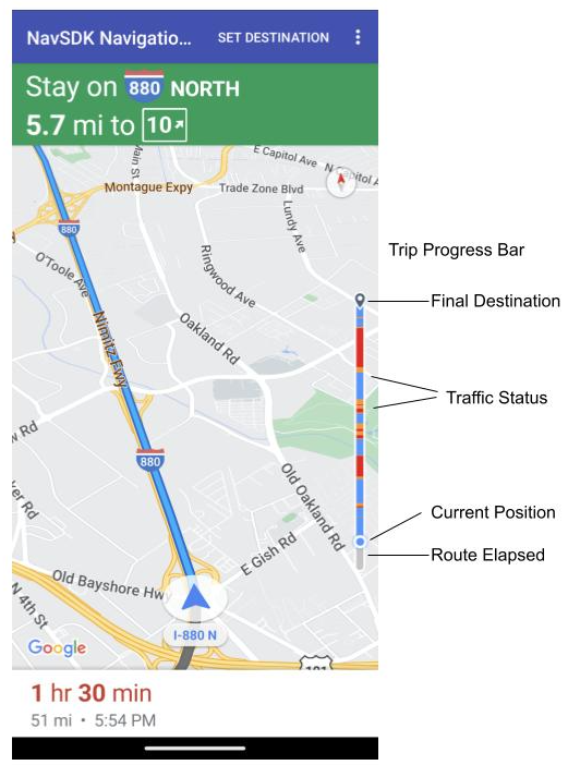
The trip progress bar is a vertical bar that appears on the trailing right edge of the map when navigation starts. When enabled, it displays an overview for an entire trip, along with the user's destination and current position.
The provides users the ability to quickly anticipate any upcoming issues, such as traffic, without needing to zoom in. They can then reroute the trip if necessary. If the user reroutes the trip, the progress bar resets as if a new trip has started from that point.
The trip progress bar displays the following status indicators:
Route elapsed—the elapsed portion of the trip.
Current position—the user's current location in the trip.
Traffic status—the status of upcoming traffic.
Final destination—the final trip destination.
Enable the trip progress bar by calling the setTripProgressBarEnabled() method
on
NavigationView
or
SupportNavigationFragment.
For example:
// Enable the trip progress bar.
mNavFragment.setTripProgressBarEnabled(true);
