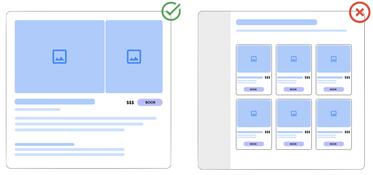
A landing page is where the user is sent after clicking on a TTD product on Google. When a landing page does not match your ad or free product listing, people are more likely to leave your site without buying anything. To show ads and free listings for your products, all landing pages that you submit to the feed need to follow the minimum requirements listed out below.
The landing page deeplink (required for Things to do Search)
The landing page deeplink is provided by the landing_page field. This should
be a landing page that shows all key elements of your product or product option.
This includes the title, attributes, description, price, currency and a button
to start the checkout flow. Title, attributes, description and images don't
always need to be identical to the content in the product feed, but they should
still refer to the same product.
Each product or option in the feed should be the most prominent product on its linked product page. If your product page has multiple products on it, such as different options or other similar products, the product or option in your feed must be the single most prominent. Category pages or list pages are not allowed as a product page (see more on category or list view pages below).

The landing page list view (optional)
In addition to the required product page, you may optionally provide a
landing_page_list_view to your product or option. Landing Page List View
should meet the following requirements:
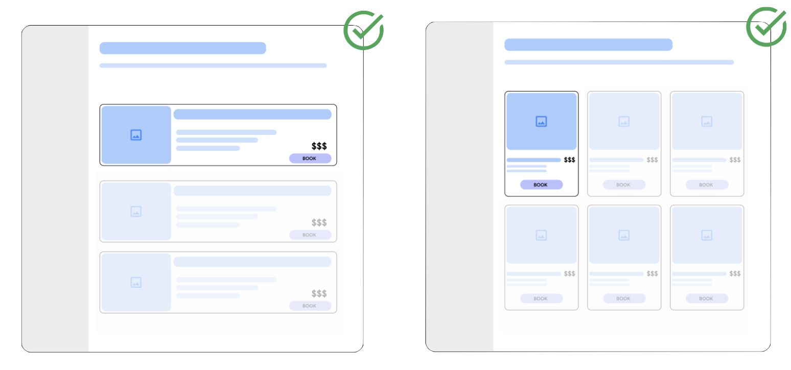
The product the user clicked on Google should be simple to identify when the user lands on a partner's site. As such, it must be prominently displayed on the landing page.
The price of the product should be simple to see and match the price provided to Google in the partner's inventory feed. If a landing page has multiple prices, the price from the advertised product must be the most prominent.
A user should land on a page where it's straightforward to navigate to book the selected product. Google requires that partners maintain a consistent presentation of the product and pricing the user selected, and a clear path to booking the product found on Google.
Google realizes partner sites are designed differently. To help, here are some examples of what's likely to be considered prominent placement:
The product is larger than other products and in the highest position on the page.
The product is highlighted on the page, either in size or differentiating colors.
The product is pinned to the right or left side of the page, distinct from other products on the page.
Avoid layouts that hide key elements of the landing page. For example, a pop-up or download banner shouldn't cover or distract from essential information for customers.

Favicons
Favicons on the landing page may be used by Google as part of the user interface. In order ensure the correct favicons are used, please make sure the deep links are indexed by Google. You may use URL Inspection Tool to ensure URLs are correctly indexed.
When are landing_page and landing_page_list_view used
Which page ends up being shown in the listing on Google depends on the
specific surface. For upper funnel queries and paid listings the list view page
takes precedence, whereas all other experiences the product page is used.