Use the following guidelines for Things to do to better reach users and drive performance for your business. While many of these guidelines are considered best practice, and therefore not mandatory, all ads and assets must comply with the Google Ads Policy.
The quality of photos are a very crucial element of Things to do. The images are used for Things to do Ads as well as the Things to do experience module. The following guidance can help you to tactically understand what makes a good versus bad image for Things to do and avoid common mistakes and pitfalls that can hurt performance.
Format requirements
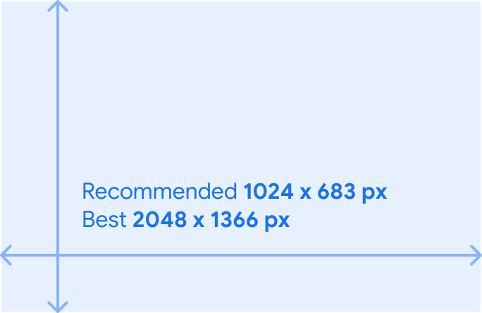
Resolution
Format requirements are generally the same as for other image or shopping ads. The images are scaled down or cropped as needed but must be big enough to fill the space.
While the minimum image size is 300x300, we recommend to provide content that's at least 1024 x 683 px with best case to be 2048 x 1366 px. This ensures sharpness is maintained after cropping and resizing.
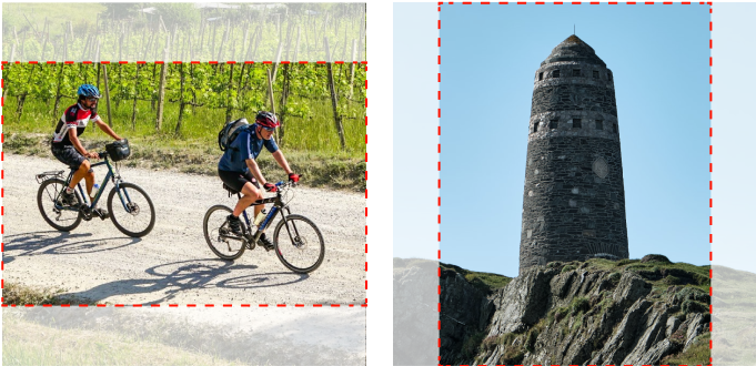
Ratio
The aspect ratio can be any however we recommend 4:3 or 1:1, with preference for 1:1 ratio which allows for more versatility in cropping the image. Vertical or horizontal subjects should be always centered and in focus.
Format
The images can't be animated. Supported formats are JPG and PNG.Image order
By default, Google selects the highest quality image from the set of
images provided by you for a particular product. If you would like to indicate
the preference for the image order, you can set product/use_media_order
to true.
Image updates
In the event an image need to be updated or replaced, make sure the URL of the new image is also changed as this ensures Google is aware of the change and recrawls the updated image.
Quality best practices
In today's visually-driven world, great photos are no longer a nice-to-have. They're a necessity — especially for the new generation of travelers. There are some key ways that improving photo quality can benefit a business. Images help users understand your business, products and brand as well as critical to ads that perform well. Providing users with the highest quality visual content possible is critical to success. Quality means many things to us, from the conceptual (telling authentic stories) to the technical (showing subjects in focus.).
Photography is one of the primary ways people learn about Things to do on Google. That means it plays a critical role in whether they decide to book. Following some photography fundamentals can transform average photos into great ones. Google reated this guide to break them down for you.
Authenticity
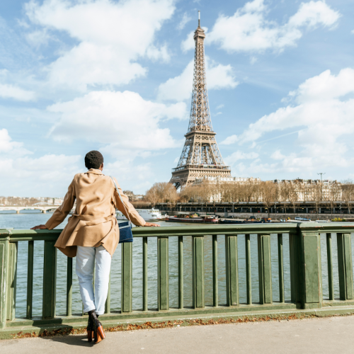
Choose content that looks natural and feels real and human. Like it was taken in the moment. Lighting and editing should feel true to life as well.
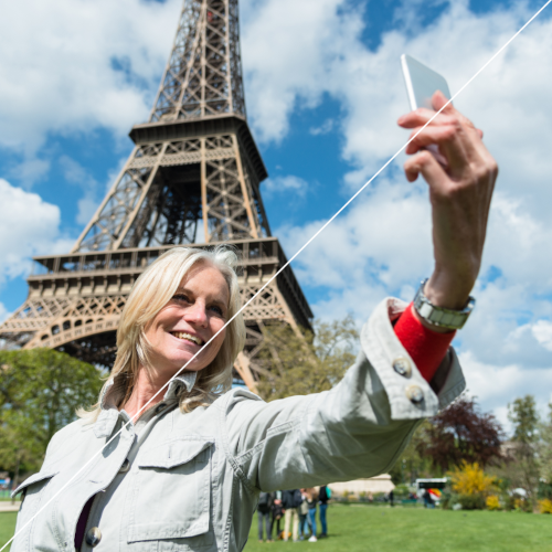
Choose content that feels staged or overly posed, avoiding selfies.
Sharpness
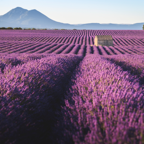
Use images that are sharp and in focus.
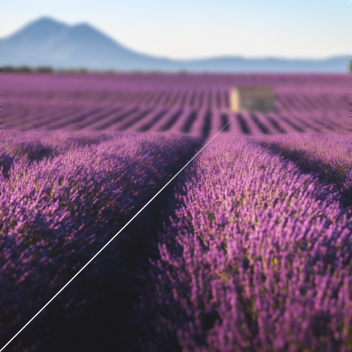
Use blurry images or content where the subject is not in focus.
Exposure
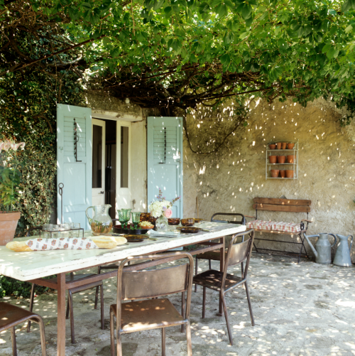
Choose images where brightness looks just right. Make sure nighttime or low-light images are bright enough to show lighter tones and detail and viceversa.
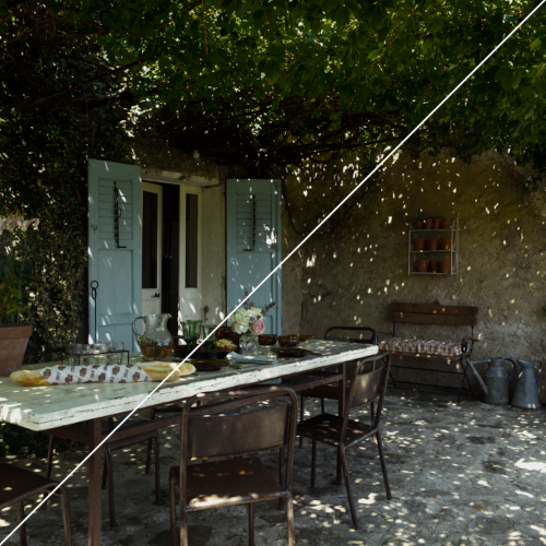
Use content that's washed out or where darkness obscures the details (overexposed or underexposed). Photos that are extremely bright or extremely dark, it's best not to use them.
Color balance and saturation

Ensure colors look true to life. Always aim for a balanced color palette. Adjust the whites of your photo to look neutral: not too yellow (warm) and not too blue (cold).

Use content that's overly cool or warm in tone. Avoid boosting saturation too much.
Composition

Make your product or service the focus of the image.

Make your product small within the frame as they become unrecognizable in thumbnail form.

Use the natural lines of an image.
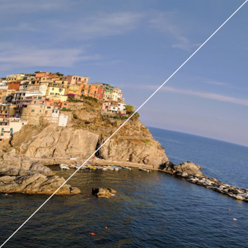
Use visually skewed or distorted images such as fish eye or extreme wide angles.

Make lines straight. Straighten your photos so that walls or ground lines appear level.

Skew or stretch your photos.
Subject matter

Show people when representing an experience or a social space. Make sure the content looks candid rather than posed.
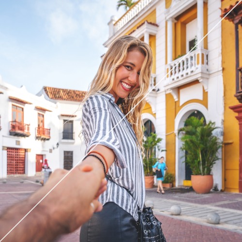
Feature people prominently unless they're necessary to show an experience or social space.
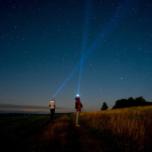
Choose content that looks natural and feels real and human. Like it was taken in the moment. Lighting and editing should feel true to life.
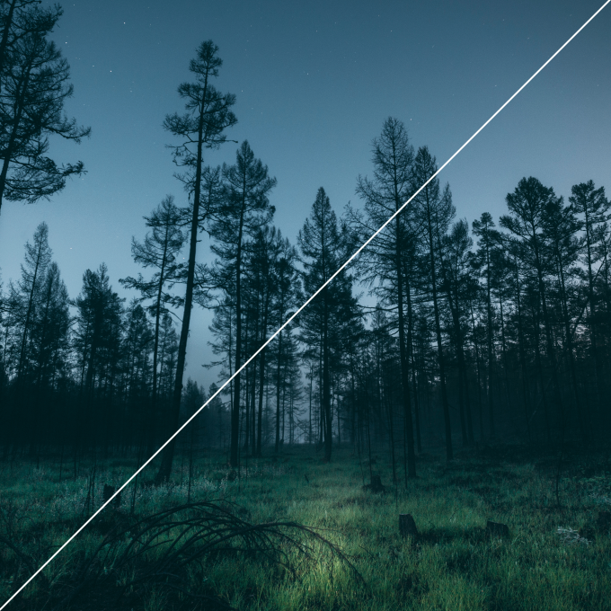
Use content taken at night if nighttime activities aren't relevant.

Show the activity as it really is.
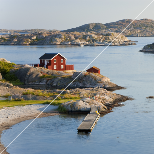
Add or remove elements. Removing or adding elements produces inaccurate photo - and could set incorrect expectations with potential customers.
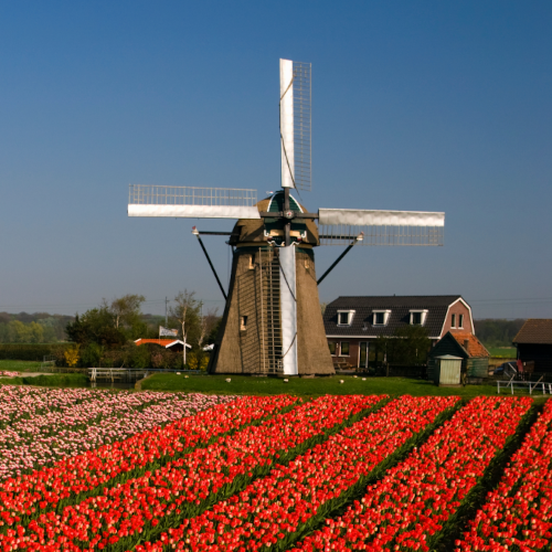
Use single images. Letting each photo stand alone makes it easier for people to understand the subject matter.
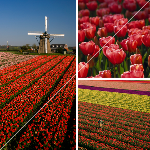
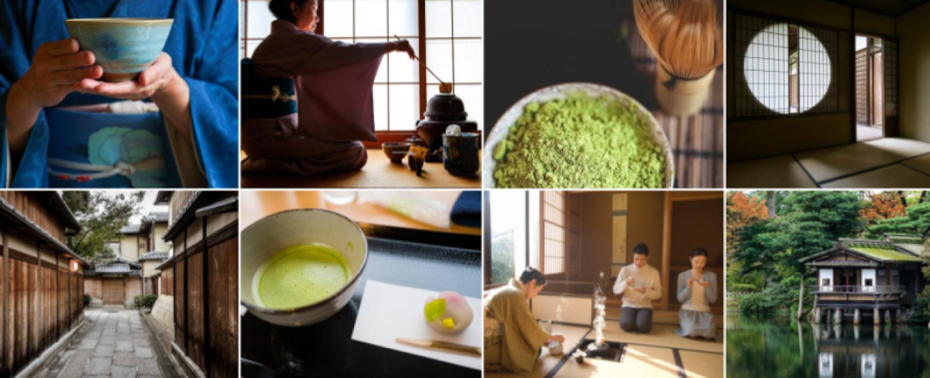
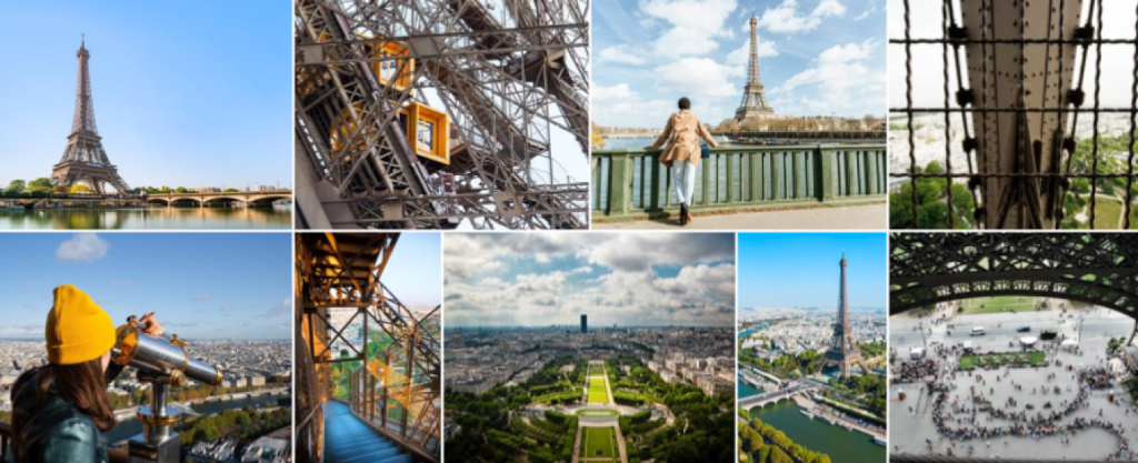
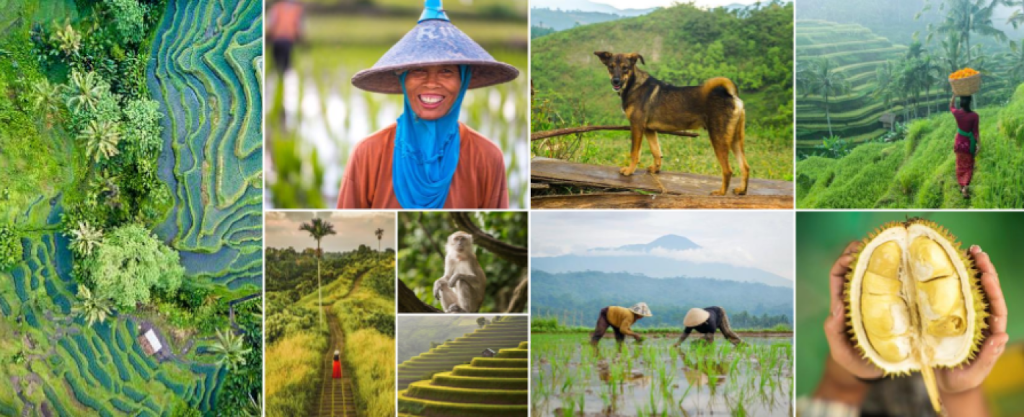
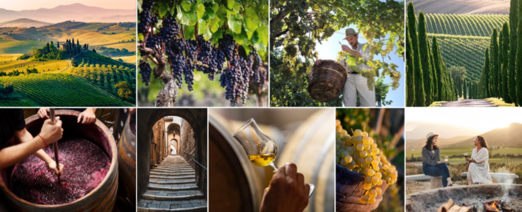
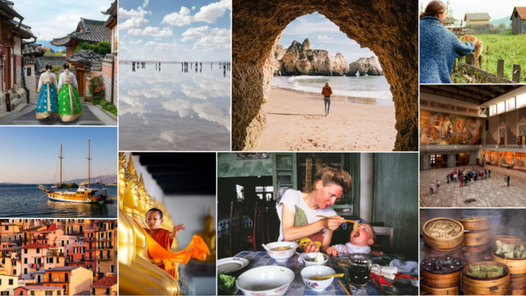
Use collages as individual images becomes very small on mobile devices.

Preserve the original image, ensuring it's the focus.

Add graphics or overlays. Don't add borders, text, buttons, or logos to your photos.
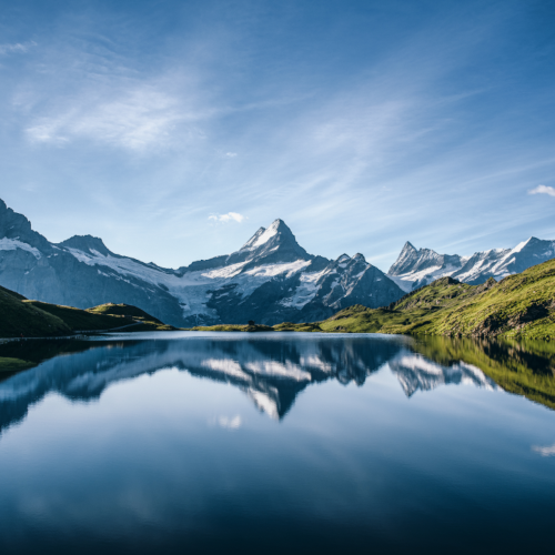
Maintain colors and tone true to life.

Use HDR or dramatic filters since the image can look harsh and artificial. Light filters may work, as long as the colors remain true to life.
Best in class examples


