Monday, December 20, 2010
Cross-posted on the Google Grants Blog
In our previous post, we did some source code maintenance —just in time for the holidays. But once users have landed on your site, how can you make sure they'll know how to get around?
As it turns out, easily accessible content on your site can make a big difference. Users tend to have a better experience when a site helps them find and understand its content. Having an accessible site not only empowers users, it also helps search engines understand what your site is really about.
So if you've resolved to boost your site's user experience and online presence for the new year, improving your content accessibility is a great way to start. Thankfully, there are tons of features you can add to make your site more accessible. In this post, we'll highlight three of them:
- Intuitive navigation
- Concise, descriptive anchor text for links
- Unique, accurate page titles throughout the site
Intuitive navigation
Help users avoid confusion by providing them with intuitive navigation, so that when they arrive at your site, they'll know where to click to find the information they're looking for.
Here are three features you can implement in order to lead your users down the right path:
- Navigational menu: Having a menu with links to the site's most important pages is the fastest, easiest way to show users where to click next.
- Text-based links: While drop-down menus, image-based links, and animation-based links can be appealing, keep in mind that users on text-only devices and some search engines may not be able to see or understand these links. Thus, many users prefer text-based links, which are also easier for search engines to crawl and interpret.
- User-viewable site map: 59% of our submissions did not have a user-viewable site map. By providing one, you display the structure of your site and give the user easy one-click navigation. If users are having trouble finding specific pages on your site, a site map can help them find their way. Don't send your users into the wild without a map!
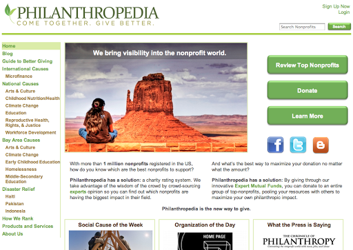
Let's explore how these features can make a site's navigation more intuitive by looking at one of our submitted sites, Philanthropedia.

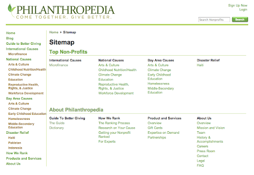
Thanks to this site's clean navigational menu, users can find all of the site's important pages within a few clicks. Wherever users end up on the site, they can always click on the "Home" button to return to the main page, or on any of the links in the menu to return to the site's important subpages. Like all of the links on this site, the links in the navigational menu are text-based links, which make it easier for both search engines and users to access the site's content. Finally, Philanthropedia has included a user-viewable site map, shown below, in case visitors are looking for a specific page not listed in the main menu.

Concise, descriptive anchor text for links
Anchor text—the clickable text of a link—can help users quickly decide which links they want to click on and find out more about. Meaningful anchor text makes it easier for users to navigate around your site and also helps search engines understand what the link's destination page is about.
20% of our submissions could improve their sites by improving the anchor text used in some of their internal links. When writing anchor text, keep two things in mind:
- Be descriptive: Use words that are relevant to the destination page, avoiding generic phrases like "click here" or "article." Make sure the user can get a snapshot of the destination page's overall content and functionality by reading the anchor text.
- Keep it concise: Anchor text that contains a few words or a short phrase is more attractive and convenient for users to read than a sentence or paragraph-long link.
Let's take a look at how anchor text played out in two user-submitted examples:
| Organization | Anchor Text Examples | User Friendliness | Anchor Text Behavior |
| The Mosaic Project |
Work for Mosaic Order Our Curriculum Guide Outdoor School |
High: Users can get an accurate idea of the content on the links' destination pages just by reading the anchor text. | Active verb phrases and rich nouns accurately describe the pages that the links are pointing to. |
| Asian Liver Center |
Learn more here |
Low: The anchor text is too generic and does not give users an idea of what the linked-to content is. | Generic phrases give little insight into the pages that the links are pointing to. |
You can learn more about anchor text and internal linking strategies by checking out this blog post on the importance of link architecture.
Unique, accurate page titles throughout the site
Each page on your site is different, so flaunt your site's diversity by giving a unique title to each page. Giving each page a unique title lets search engines know how that page is distinct from others within your site. In our analysis, over 28% of sites could have improved their site quality by adding unique page titles.
Let's check out a few more examples to see what a difference unique, accurate page titles can make:
| Organization | Page Title Examples | User Friendliness | Page Title Behavior |
| VAMS International |
Upcoming Events | VAMS International Request Service | VAMS International FAQ's | VAMS International |
High: Each page's content is relevant to its title, and the user can get a good idea of each page's unique offerings and functionality. | Concise, rich language joined with the organization's name accurately describes the corresponding pages. The titles show how each page is unique while also acknowledging that they are all associated with one organization. |
| MHCD Evaluation and Research | MHCD Evaluation and Research | Low: This site contains a lot of diverse content and rich functionality; however, the uniform page titles do not convey these strengths. | This page title is too general and does not accurately describe the content on each page. The same title is used across all the pages on this site. |
Wrapping things up
We hope that this blog post has given you some ideas on how to ring in the new year with improved content accessibility, which can boost the user experience and online presence for your site.
To learn more about the features discussed here and in our previous two site clinic posts, check out our SEO Report Card and SEO Starter Guide.
This blog post wraps up our website clinic for non-profits. We send our warmest regards to all the great non-profit causes you are working on, and thanks to everyone who took the time to submit their sites and read our posts!
