Tuesday, May 01, 2012
We love data, and spend a lot of time monitoring the analytics on our websites. Any web developer doing the same will have noticed the increase in traffic from mobile devices of late. Over the past year we've seen many key sites garner a significant percentage of pageviews from smartphones and tablets. These represent large numbers of visitors, with sophisticated browsers which support the latest HTML, CSS, and JavaScript, but which also have limited screen space with widths as narrow as 320 pixels.
Our commitment to accessibility means we strive to provide a good browsing experience for all our users. We faced a stark choice between creating mobile specific websites, or adapting existing sites and new launches to render well on both desktop and mobile. Creating two sites would allow us to better target specific hardware, but maintaining a single shared site preserves a canonical URL, avoiding any complicated redirects, and simplifies the sharing of web addresses. With a mind towards maintainability we leant towards using the same pages for both, and started thinking about how we could fulfill the following guidelines:
- Our pages should render legibly at any screen resolution
- We mark up one set of content, making it viewable on any device
- We should never show a horizontal scrollbar, whatever the window size

Implementation
As a starting point, simple, semantic markup gives us pages which are more flexible and easier to
reflow if the layout needs to be changed. By ensuring the stylesheet enables a
liquid layout,
we're already on the road to mobile-friendliness. Instead of specifying width for
container elements, we started using max-width instead. In place of
height we used min-height, so larger fonts or multi-line text don't
break the container's boundaries. To prevent fixed width images "propping open" liquid columns,
we apply the following CSS rule:
img {
max-width: 100%;
}
Liquid layout is a good start, but can lack a certain finesse. Thankfully media queries are now well-supported in modern browsers including IE9+ and most mobile devices. These can make the difference between a site that degrades well on a mobile browser, vs. one that is enhanced to take advantage of the streamlined UI. But first we have to take into account how smartphones represent themselves to web servers.
Viewports
When is a pixel not a pixel? When it's on a smartphone. By default, smartphone browsers pretend to be high-resolution desktop browsers, and lay out a page as if you were viewing it on a desktop monitor. This is why you get a tiny-text "overview mode" that's impossible to read before zooming in. The default viewport width for the default Android browser is 800px, and 980px for iOS, regardless of the number of actual physical pixels on the screen.
In order to trigger the browser to render your page at a more readable scale, you need to use the viewport meta element:
<meta name="viewport" content="width=device-width, initial-scale=1">
Mobile screen resolutions vary widely, but most modern smartphone browsers currently report a
standard device-width in the region of 320px. If your mobile device actually has a
width of 640 physical pixels, then a 320px wide image would be sized to the full width of the
screen, using double the number of pixels in the process. This is also the reason why text looks
so much crisper on the small screen – double the pixel density as compared to a standard desktop
monitor.
The useful thing about setting the width to device-width in the viewport
meta tag is that it updates when the user changes the orientation of their smartphone or tablet.
Combining this with media queries allows you to tweak the layout as the user rotates their device:
@media screen and (min-width:480px) and (max-width:800px) {
/* Target landscape smartphones, portrait tablets, narrow desktops

*/
}

@media screen and (max-width:479px) {
/* Target portrait smartphones */
}
In reality you may find you need to use different breakpoints depending on how your site flows and
looks on various devices. You can also use the orientation media query to target
specific orientations without referencing pixel dimensions,
where supported.
@media all and (orientation: landscape) {
/* Target device in landscape mode */
}

@media all and (orientation: portrait) {
/* Target device in portrait mode */
}
A media queries example
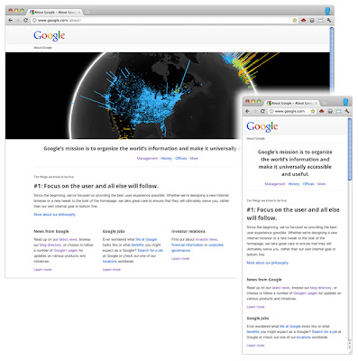
We recently re-launched the About Google page. Apart from setting up a liquid layout, we added a few media queries to provide an improved experience on smaller screens, like those on a tablet or smartphone.
Instead of targeting specific device resolutions we went with a relatively broad set of breakpoints. For a screen resolution wider than 1024 pixels, we render the page as it was originally designed, according to our 12-column grid. Between 801px and 1024px, you get to see a slightly squished version thanks to the liquid layout.
Only if the screen resolution drops to 800 pixels will content that's not considered core content be sent to the bottom of the page:
@media screen and (max-width: 800px) {
/* specific CSS */
}
With a final media query we enter smartphone territory:
@media screen and (max-width: 479px) {
/* specific CSS */
}
At this point, we're not loading the large image anymore and we stack the content blocks. We also added additional whitespace between the content items so they are more easily identified as different sections.
With these simple measures we made sure the site is usable on a wide range of devices.

Conclusion
It's worth bearing in mind that there's no simple solution to making sites accessible on mobile devices and narrow viewports. Liquid layouts are a great starting point, but some design compromises may need to be made. Media queries are a useful way of adding polish for many devices, but remember that 25% of visits are made from those desktop browsers that do not currently support the technique and there are some performance implications. And if you have a fancy widget on your site, it might work beautifully with a mouse, but not so great on a touch device where fine control is more difficult.
The key is to test early and test often. Any time spent surfing your own sites with a smartphone or tablet will prove invaluable. When you can't test on real devices, use the Android SDK or iOS Simulator. Ask friends and colleagues to view your sites on their devices, and watch how they interact too.
Mobile browsers are a great source of new traffic, and learning how best to support them is an exciting new area of professional development.
Some more examples of responsive design at Google:
- www.google.com/about/
- www.google.com/goodtoknow
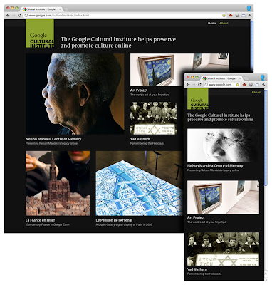
- www.google.com/culturalinstitute
- www.google.com/events/sciencefair
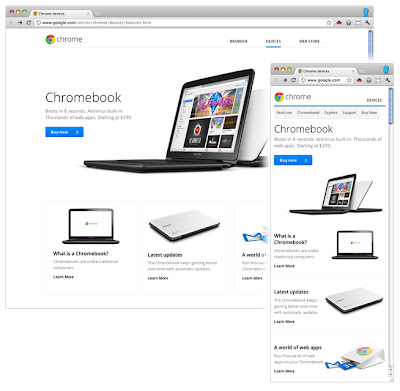
- www.google.com/intl/en/chrome/devices
- picasa.google.com
